03 / Design principles
A shared language.
A coherent collection begins with a repeatable system, then leaves room for individual character.
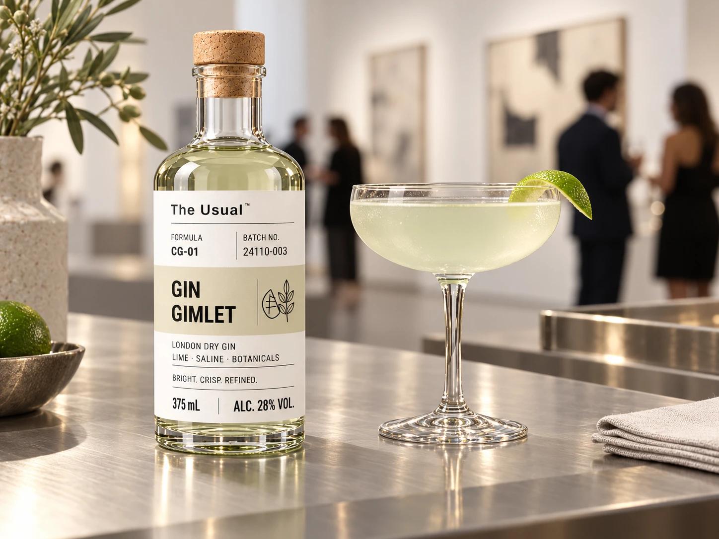
Keep the architecture.
The brand, formula and batch identifiers, cocktail-name band, composition, volume and ABV follow the same hierarchy. Consistency lets the name and ingredients do the work.
Use color with purpose.
A restrained color band identifies the cocktail. It sits within the same typography and label proportions, giving each formulation a point of recognition without turning it into an unrelated product.
Make room for the product.
Quiet typography and clear space let the materials remain visible: the clarity of the glass, the black of the closure and the matte surface of the label. The system gives the collection a familiar shape.
Explore the collection